Damn, you're completely art-mogging me here, but hey, not everyone can be first place, and that's okay. I get it, but I get mogged in real life and now online, too. Sigh it just hurts just a tad is all...

But ignoring my bitching, it's all beautiful. Trust me when I say you have the skill, and if you keep this up, you have something going here that is definitely better than anything I've ever done or even seen aside from professional artists.
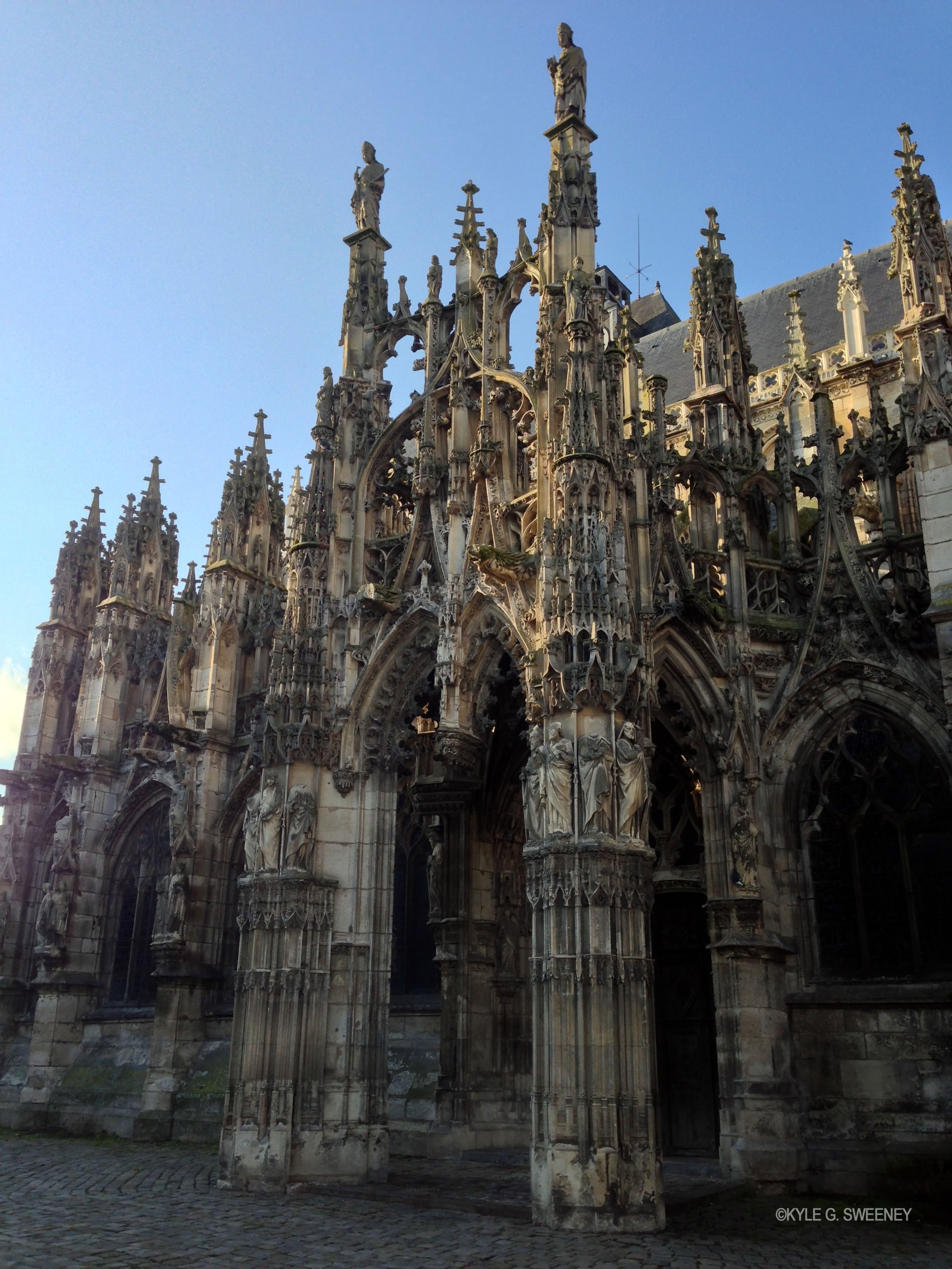
I like the perspective from the first panel, from the ground up, which gives the building and surrounding environment more scale, and the details are good. I'm assuming it's not finished, so I can't really criticize the lack of color or anything like that, but overall it's good. A solid B, for sure.
And for the next four, I'm going to sum up real fast.
The first is Sasuke from a back angle. And it is definitely a solid character sketch as you clearly see who it is with its clear and solid lines and a good amount of color. It reminds me of those Japanese artworks. Light yet conveys the intended values. I like this one more than your Pochita drawing, to be honest. I just like the style as I've said before.
For the next, it's your sketches of the heads of a character I don't recognize. (OC?) The one with black hair and vacant eyes. Nice look. It seems like a character with a tragic past and on a quest for revenge. I think I like the third style of hair the most; it captures the frazzled, unkept feel, like a homeless man or something of the sort.
Then, the third one looks like a key animation frame. I'm not sure if it's Sasuke or the other character, but it definitely has that look. Black hair, sharp eyes, katana, and lone wanderer attire. The sharp, edgy, dark lines on his clothes look great and bring out the harshness of the image, and the proportions are solid. This is my second favorite of the bunch.
Then, for the last, another character I don't recognize. This one seems to me the least finished of the bunch. A monster-esque figure with (correct me if I'm wrong here) a wooden head, like a tree. Or is it like a sea monster? I can't really tell, so I apologize if I'm totally missing the mark here. He's got a nice big head with loads of details. I like his little hat or head ornament. Kinda reminds me of a Christmas decoration. I like the overall design its just a bit... difficult for me to distinguish what the character is. He has a nice sword arm, though, on his right.
Are you making a fighting manga in the same vein of Chainsaw Man? If so, then you're definitely on the right path.
So yeah, you have some beautiful sketches here. I didn't dislike a single one; they are all solid on their own, but as I said, I liked the Sasuke one the most.
You've got skill and talent. Keep on working, and you're going places. Maybe not necessarily the big leagues, but places nonetheless.
PS: Sorry for taking a while to reply; like I said before, I'm kind of a retarded sperg with the internet. I just bounce from place to place and its tough to stay focused on a topic.


