JestER
Clown World Analyst
★★★★★
- Joined
- Apr 3, 2019
- Posts
- 13,687
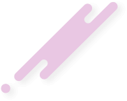
took me like 2 minutes to make in mspaint jfl, yes i'm bored af


ngl one of the best flags I've seen
Simple and great.
Looks too much like the faggot flags, just grayscaled. We need a flag that stands outThis is the only incel flag
thank youSimple and great.
Make the flag your avi or your signature tbh
Thanks, but like I said it's very crude and unpolished. If some artcel could help me clean this up I might do, I have no experience with design myself.Make the flag your avi or your signature tbh
While this site probably won't change their logo to the flag you can at least get recognition for how it belongs to you that way.
tyLooks great imo
OP’s inkler flag is a little too basic tbh, it doesn’t really stand out or leave a mark like the others I’ve seen. Honestly I’m really liking the one @FullTimeLoser posted and how it kinda mocks the LGBTQXYZ pride flags. I like the one @Diocel posted toongl one of the best flags I've seen
@WØLF thoughts?
I like it tbh
nah thats gayIf you make it into a X it looks cooler.
Especially the stormfront onesflags are retarded
Ynah thats gay
Sell me that flag as a printed flag so that I can hang it up in my room.
I like OP's design because it can be taken as showing the blackpill in multipel dimensions: 1D, 2D and 3D. The slash in the circle allows for this. Very ingenious. @ERadicator stick with this flag please. Maybe put it in your signature or as your avi.OP’s inkler flag is a little too basic tbh, it doesn’t really stand out or leave a mark like the others I’ve seen. Honestly I’m really liking the one @FullTimeLoser posted and how it kinda mocks the LGBTQXYZ pride flags. I like the one @Diocel posted too
Just as brevity is the soul of the wit sometimes the simplest designs are the most effective tbhnglThanks, but like I said it's very crude and unpolished. If some artcel could help me clean this up I might do, I have no experience with design myself.
That is exactly was I was going for. There still things that could be improved but are out of my skillset, such as removing the jagged edges. I don't feel like watching 30min videos on photoshop just to solve this. Anyhow I redesigned it a little, inverted the pill symbol because it looked too much like the "no entry" symbol (unless ppl here prefer that), centred it a little more and made the ring look more fine. Still I would appreciate if someone cleans this up a little, lmk what you guys think.Just as brevity is the soul of the wit sometimes the simplest designs are the most effective tbhngl
You would do well to keep the design as is ngl don't see how it can be improved upon. Any additions would only be detractions from the existing design.
Not a bad idea to get it printed tbh, but selling it would not be a good idea bc bad pressSell me that flag as a printed flag so that I can hang it up in my room.
The Glorious hermit kingdom of IncelistanInceldia...my home
tbhflags are retarded
flags are retarded
Leave it as is imo. Other than centering the circle I don't think there is anything else to be done. Any further tweaks will be detracting from it.That is exactly was I was going for. There still things that could be improved but are out of my skillset, such as removing the jagged edges. I don't feel like watching 30min videos on photoshop just to solve this. Anyhow I redesigned it a little, inverted the pill symbol because it looked too much like the "no entry" symbol (unless ppl here prefer that), centred it a little more and made the ring look more fine. Still I would appreciate if someone cleans this up a little, lmk what you guys think.
View attachment 425222
Unironically high IQ because any flag is part of a propaganda that uses Chad worship in which this blackpill incel flag can't fit this said Chad worship criteria.flags are retarded
I like the original no entry symbol way better. In a way the blackpill is forbidden knowledge and not for everyone. It's meant for low status sexless males @AAAAAAAAAAAcelThat is exactly was I was going for. There still things that could be improved but are out of my skillset, such as removing the jagged edges. I don't feel like watching 30min videos on photoshop just to solve this. Anyhow I redesigned it a little, inverted the pill symbol because it looked too much like the "no entry" symbol (unless ppl here prefer that), centred it a little more and made the ring look more fine. Still I would appreciate if someone cleans this up a little, lmk what you guys think.
View attachment 425222
Didn't think so much of the flag asymmetry and the mis-alignment of the circle but imo the original no-entry design of the slash (upper-left to lower-right) through the circle should stay.Based and high IQ.
Life as an incel is basically one booming echo of "No."
The flag asymmetry is especially appropriate.
Tbh I think a flag should be something to represent us more than a symbol for outsiders. Normies (and their worshippers) may larp as much as they like, they will never be truly blackpilledI like the original no entry symbol way better. In a way the blackpill is forbidden knowledge and not for everyone. It's meant for low status sexless males @AAAAAAAAAAAcel
But sexless males are by default outsiders so it makes sense to have the no-entry symbol design tbhTbh I think a flag should be something to represent us more than a symbol for outsiders.
tbhnglNormies (and their worshippers) may larp as much as they like, they will never be truly blackpilled
The black pill and the forbidden knowledge it holds, surrounded by an endless void of nothingness that is our lives.what does this sign symbolise?
thank you GrAYcelLooks nice.